

Website
A website that promotes the value of the restaurant and provides necessary contact information. In addition, the website provides nutrition information on all ingredients to help users learn about what they eat. Users could also book their meals on the website to take out or pickup.
Personal Project
User research UX Design UI Design
Adobe XD Figma
1 month
We strive to provide nutrition information for all the ingredients and offer customers as much freedom as possible when ordering burritos.
Our objective is to create a nutrition calculator that allows users to access the nutritional information. Additionally, once they have finished making their selection, they should be able to place an order for the customized burrito directly.
With the goal of assisting my friend's entrepreneurial endeavor in the restaurant industry, I took on the task of designing a responsive website for Roli Burrito. To ensure that the website catered to the needs of potential customers, I conducted extensive user research. This involved interviewing my friend to gain insights from a client's perspective and also reaching out to individuals in my network who had experience with online ordering. By gathering valuable feedback and insights from these interviews, I was able to incorporate user preferences and expectations into the website's design and functionality. The result is a user-friendly platform that effectively showcases Roli Burrito's offerings and provides a seamless online ordering experience.
Aliceis a office worker who needs scheduled pick-up service because she needs to save time and money.

Alice is an ordinary office lady who needs to save money and strives for a slim yet healthy body shape. To relieve her stress, she enjoys going out and buying her lunch to bring back to the office. However, the restaurants are always crowded during lunchtime.
In most cases, customers find it difficult to obtain nutrition information.
Ordering on-site can also be a tiresome process, especially when there are a lot ofpeople during lunchtime.

On a restaurant website, users usually expect to have order and reservationfunctions. Therefore, a significant portion of the website focuses on these functions, along with the account function that allows users to manage their order and reservation history.
My goal is to ensure easy navigation for users, so I strive to keep the website simple and minimize the number of layers.

The challenge lies in making the list easy to comprehend and integrating the nutrition calculator with the order function.

Nowadays, people increasingly browse websites on mobile devices rather than desktops. Therefore, it is important to create a mobile version as well.

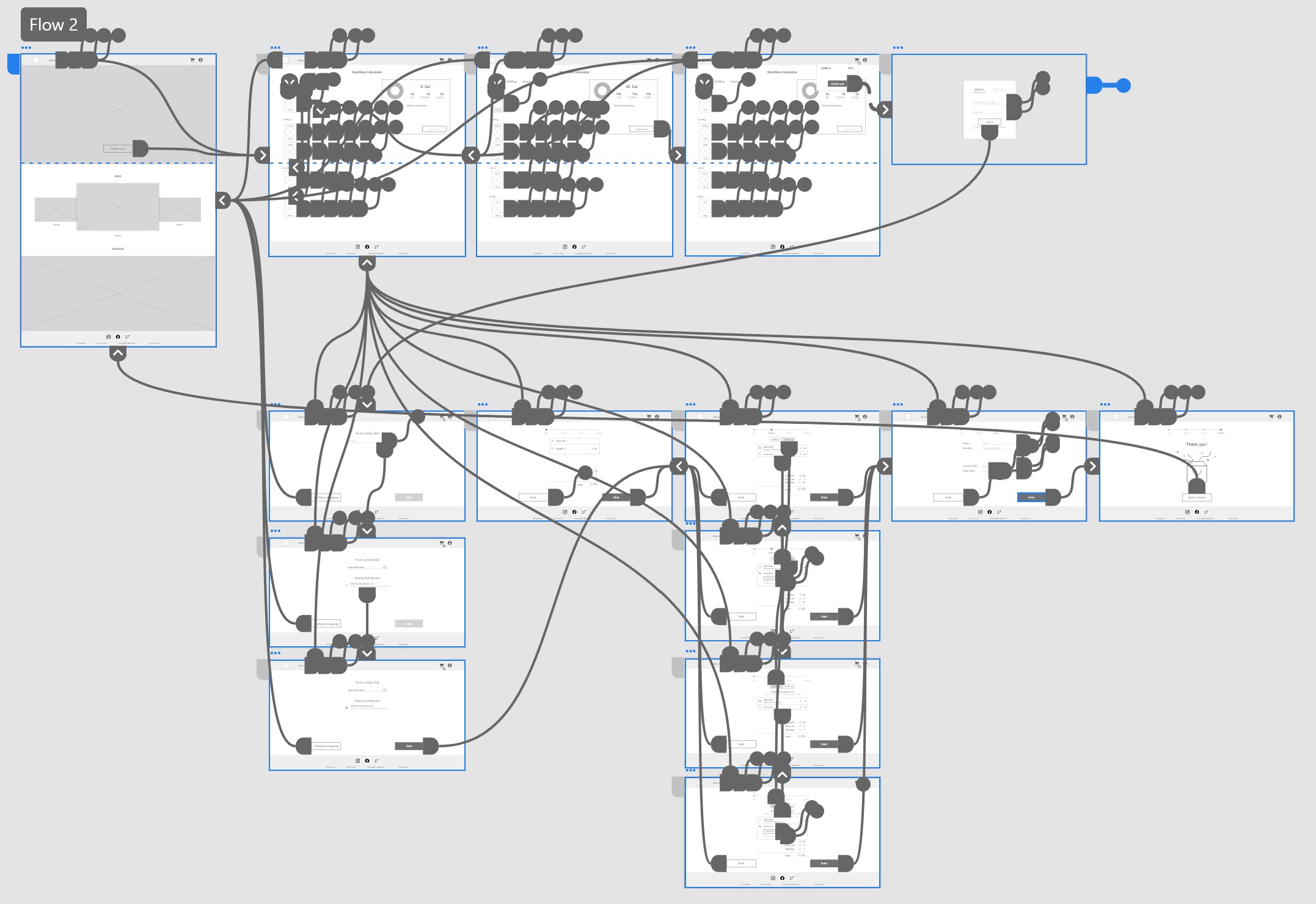
For a more precise representation and streamlined workflow, I have begun the process of converting paper wireframes into digital ones. Additionally, I am establishing a hierarchy for text and elements.


View Roli Burrito Lo-fi website prototype
To create a low-fidelity prototype, I connected all screens involved in the main user flow. In Adobe XD, the components function helps to expedite the process.
Unmoderated usability study
Taiwan,remote
5participants
20-30minutes
Hereare the main findings uncovered by the usability study:
The initial step of the checkout flow, which is finding a nearby Roli, often confuses users as it doesn't appear to be the starting point of the checkout process. To address this issue, I have implemented a checkout flow map that clearly indicates the section users are currently in, providing them with a better understanding of the overall process.

Users have expressed their feedback regarding the absence of information about open hours and contact details. In response, I have redesigned the home page to incorporate these crucial pieces of information. Now, users can easily access the open hours and contact information, ensuring a more informative and user-friendly experience.


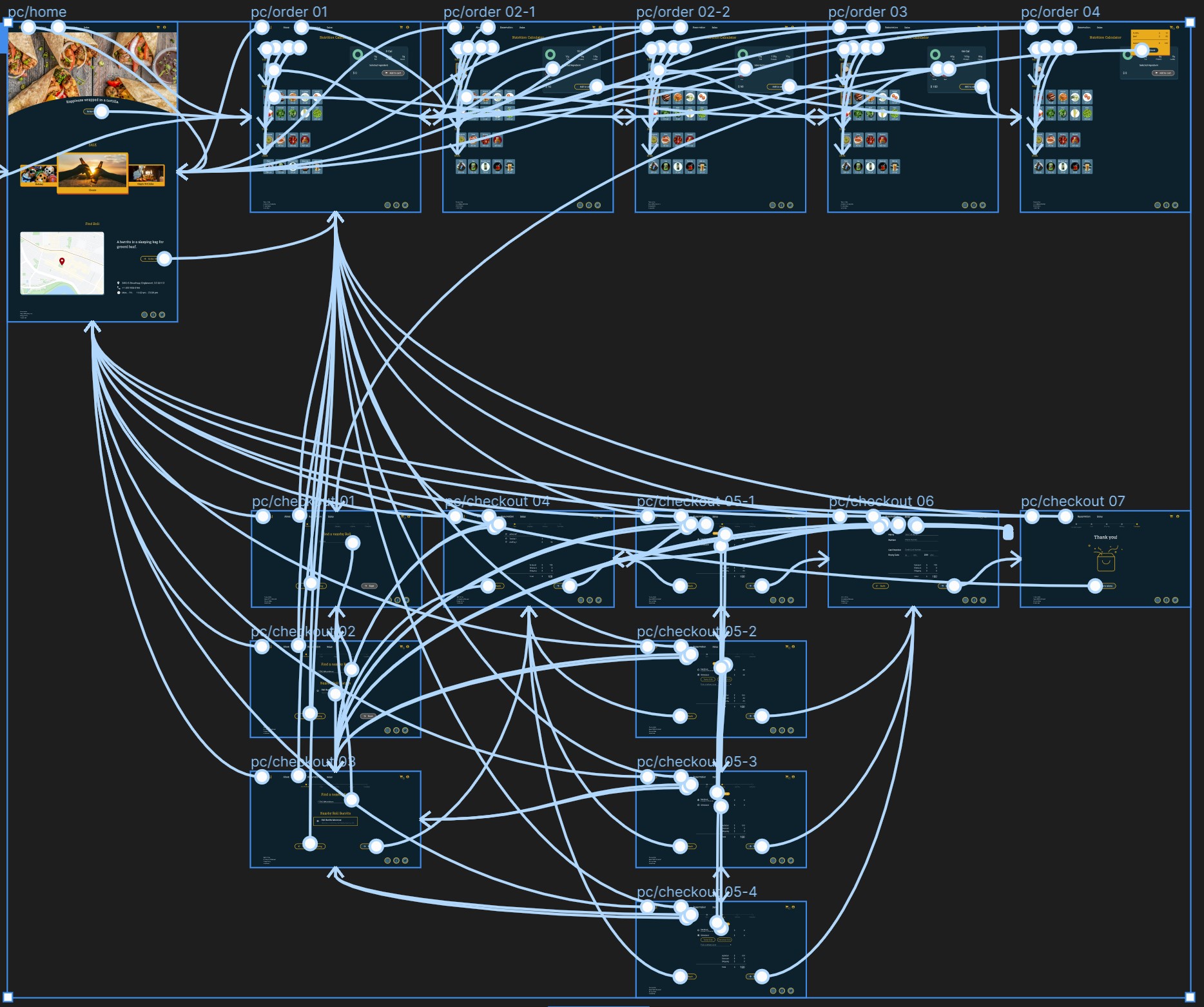
View Roli Burrito hi-fi prototype
The hi-fi prototype I have developed follows the same user flow as the low-fiprototype, incorporating certain changes and improvements based on the resultsof the usability study. These enhancements aim to address any usability issuesand refine the overall user experience.
Feedback on the hi-fi prototype revealed that the design was intuitive and easy to navigate, while the order function was particularly straightforward and understandable.
Every time I conduct a usability study, I receive valuable feedback that not only refreshes my thoughts but also highlights the interesting fact that everyone thinks differently. This realization has helped me become more receptive to advice and maintain an open-minded approach to design.


